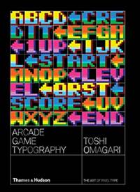
Arcade Game Typography
Knihu kúpite v
1 e-shope
od
24,65 €
Ak sa vám po kliknutí na tlačidlo "Do obchodu" nezobrazí stránka knihy vo vybranom e-shope, je potrebné vypnúť AdBlock vo vašom prehliadači pre našu stránku.
Návod na vypnutie je napríklad na adrese https://www.sme.sk/dok/20466299/ako-vypnut-adblock-na-sme-sk-whitelist.
Krátky popis
Arcade Game Typography presents readers with a fascinating new
world of typography – the pixel typeface. Video game designers of
the 70s, 80s and 90s faced colour and resolution limitations that
stimulated incredible creativity: with letters having to exist in
an 8x8 square grid, artists found ways to create expressive and
elegant character sets within a tiny canvas. Featuring pixel
typefaces carefully selected from the first decades of arcade video
games, Arcade Game Typographypresents a previously undocumented
‘outsider typography’ movement, accompanied by insightful
commentary from author Toshi Omagari, a Monotype typeface designer
himself, and screenshots of the type in use. Exhaustively
researched, this book gathers an eclectic typography from hit games
such as Super Sprint, Pac-Man, After Burner, Marble Madness,
Shinobi, as well as countless lesserknown gems. The book presents
its typefaces on a dynamic and decorative grid, taking reference
from high-end type specimens while adding a suitably playful twist.
Unlike print typefaces, pixel type often has bold colour ‘baked in’
to the characters, so Arcade Game Typography looks unlike any other
typography book, fizzing with life and colour.
Výber kníh autorov
Thames & Hudson Ltd ,
Toshi Omagari

Zobraziť všetky knihy autora
Thames & Hudson Ltd,
Toshi Omagari
Výber kníh vydavateľa
Slovart
Zobraziť všetky knihy vydavateľa
Slovart
Naše tipy